Nutrient Cycle Infographic: Nitrogen
For this post, I made an infographic on the Nitrogen Cycle. Nitrogen's chemistry has been important for my Master's research (nitrification in drinking water distribution systems) and now in what I do professionally (removal of nitrogen from wastewater, among many other things).
I've seen plenty of graphics of nutrient cycles, but most of them are cartoony things like this that aren't as informative as they could be. So I was inspired to try drawing one of my own that would do a good job presenting some of the key information on the chemical reactions involved.
This is what I came up with:
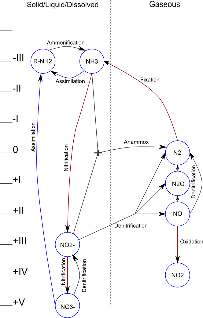
Here is a guide to interpreting the information in this infographic:
- The oxidation state of Nitrogen in each compound is shown on the axis on the left. This is an important detail, because it determines whether a particular reaction releases energy (moving downward on the axis to a higher oxidation state) or has to be coupled with an external source of chemical energy (e.g. organic carbon compounds for denitrification).
- The dashed line down the middle separates gaseous compounds on the right from solid, liquid, or dissolved compounds on the left. The significance of this is that the atmosphere (i.e. a gaseous state) serves as a near-infinite source/sink for the Nitrogen Cycle.
- Reactions that take place in the presence of oxygen are coloured a rusty red, reactions in the absence of oxygen are coloured charcoal, and reactions that can be either aerobic or anoxic/anaerobic are coloured blue.
An interesting point to note is that this infographic format is a poor fit for another common nutrient—Phosphorus. Phosphorus is almost always at the same oxidation state (+5), and it doesn't form any gaseous compounds under environmentally-relevant conditions. These properties mean that it doesn't cycle as quickly/easily as Nitrogen and can thus often be the limiting nutrient for growth. These properties also make it challenging to remove from wastewater.
Note that I'm working on similar infographics on Sulfur and Carbon, so you can expect another post like this soon.